5 Top Flutter Widgets For Developers
August 7 , 2020 Posted by Admin
If you have ever delved into Flutter, you might have thought that it has a very steep learning curve. It might be true. A lot of people say the same thing. But the learning curve is steep because we probably take on too much simultaneously. We try to learn everything at once and fail at it. The key is to learn one thing at a time so that we can manage the curve according to our learning styles and according to our intellect. Once you do that, you will realize that learning Flutter is not that big a deal and you were just making a mountain out of a molehill.
What are Flutter Widgets?
Here, we will discuss Flutter Widgets, what they are, and what they do. If you want to do custom app development, you must work with widgets. If you want to do any kind of app development, you will have to use widgets.
Widgets are elements that you use in your user interface. Anything could be a widget. It could be the text, a button, checkboxes, images, etc. Suffice it to say that everything you use in your user interface is a widget, whether for custom Android development or iOS.
If you know what custom iOS development is or what Android development is, then you will fully understand the concept of views (in Android) and UIViews (in iOS). Just think of your widgets as blueprints. They tell Flutter where you want to place certain elements and how to render them for the outcome.
Here, we list the top 5 Flutter widgets for developers, young and experienced alike.
1. Safe Area Widget
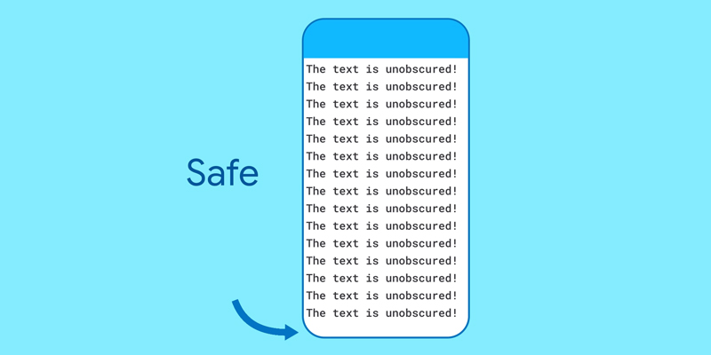
Do you know the concept of notches? If you are building apps for modern-day devices, you must. You might not like them, but you are stuck with them. The main purpose of notches is to shift the elements from the front face of our phones. But the problem is that rounded corners and notches screw up the app’s layout. When you use Flutter to build your custom apps, you have the choice of using the Safe Area Widget to work around this problem.
This widget does nothing more than wrap your main layout so that there is no overlapping of content or clipping. It’s easy to use and you can ensure that your users see all the content that you want them to see.
2. Expanded Widget
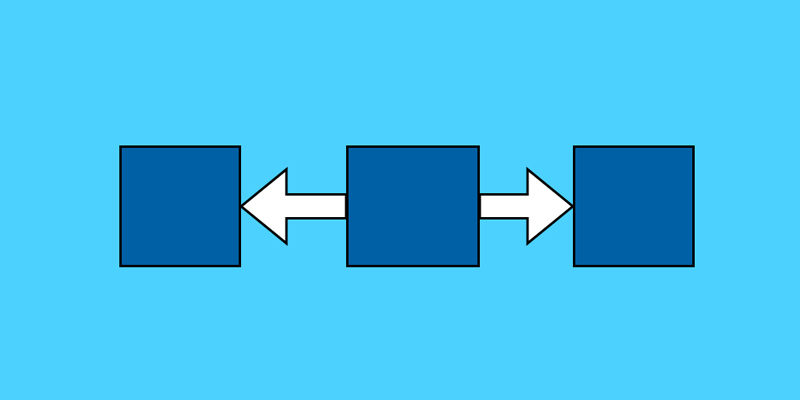
In Flutter, you have to work on a screen layout that is comprised of rows and columns. Whatever you do, you have to do it between these rows and columns. Having a grid like this is beneficial as you can arrange all your widgets on the screen in an organized and systematic manner. The problem is that the rows and columns can distribute your elements according to the available space. What does this mean? It means that all your elements might come on the screen on the left side, or they can have an equal amount of space between them. When this happens, there might be some extra space left between the elements.
What are you going to do with the extra space? How will you fill it?
You will just use the Expanded Widget to take care of it. Just put the element inside this widget to make it expandable. Whatever extra space is left, the expanded widget will take it up.
3. Wrap Widget
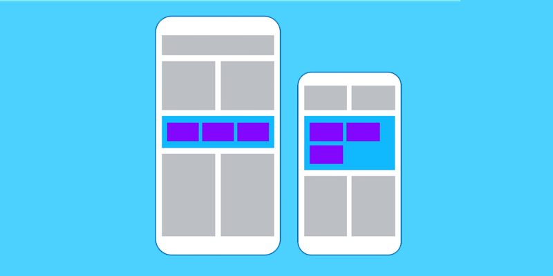
Earlier, we discussed that we place elements on the screen on a grid of rows and columns. These two are widgets themselves, and they make designing the layout smooth and effortless. You can place your widgets on these rows and elements any way you like. But what happens when your widget is too wide to fit into the rows? When this happens, you see a black and yellow block on your screen and the accompanying error ‘Right overflowed by 471 pixels’ or something like that. So, how are you going to take care of this problem?
With the Wrap Widget, of course.
The Wrap Widget is the same as the rows and columns grid that you’ve been working on. The only difference, or should we say advantage, is that it has the power to adjust the elements that you want to put on the screen. It knows how much space is available on the screen and adjusts the elements accordingly. You can arrange the elements horizontally or vertically. You can even change the direction property.
4. Rich Text Widget
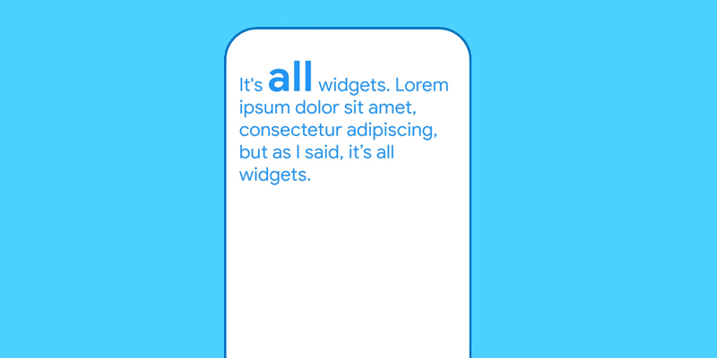
If you want to display a paragraph in Flutter with different styles, then the Rich Text Widget is the one you want to use. You implement multiple TextSpan widgets inside the Rich Text Widget and set a different style for each. This way, you will create a tree of TextSpan objects, each of them inside the main Rich Text Widget. You can show multiple styles on the same line or paragraph.
5. ClipRect and ClipRRect
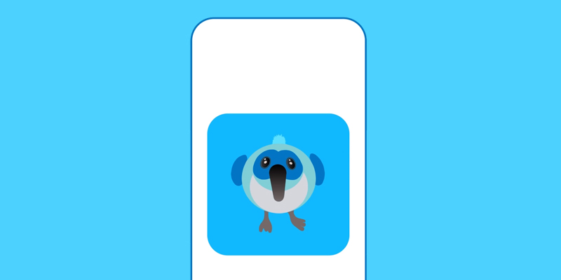
These two are almost the same, that’s why we thought of discussing them together. You can use them to clip an element with a rectangular shape. The only difference is that while ClipRect uses a rectangular shape with edges, the ClipRRect widget uses a rectangular shape with rounded corners. Other than that, they both have the same purpose.
Conclusion
So, these are some of the most used and popular widgets in Flutter. They are also the basic building blocks of any custom mobile app development project. So, make sure you explore them fully and find out all your options. Happy Coding!
Also Read: Why custom app development is trending for businesses
Case Studies
Services

We at App Development Pros, a renowned mobile app development company, are like superheroes of the smartphone app world! We provide digital opportunities in the mobile app design form and help you turn fantastic ideas into powerful mobile apps for your business needs. Our top-notch app development services build the perfect mobile applications for your needs by working closely with you, making us one of the USA's best mobile app development companies.
2025 (c) App Development Pros - Privacy Policy - All Rights Reserved


Leave a Reply